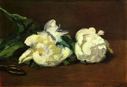
Breakin’ the composition rules, and still winning. This painting by Edouard Manet has two strong circle shapes side by side, almost centered, which is generally not advised for a great composition. Then add a strong line going off the edge of the canvas — whoosh — eyes are in danger of leaving the picture. Yet a subtle pair of stem snippers at the left pulls eyes both off to the left AND back in, and the even more subtle table top/horizon line brings eyes back to the center and the subtleties of shading in the flowers.
Economy of color, stroke, subject, shadow. It’s big contrasts, and some subtle tricks that make it work.
Yep. He wins.


Leave a Reply