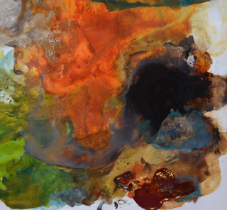
Oh, I love warm colors, and it shows. I have made plans for blue paintings, or cool color paintings, or paintings with a grayed-out overall feel, but more often than not, they get toned into a warm palette.
Personal Color
Do you remember Color Me Beautiful? Carole Jackson’s book and system of paying attention to people’s coloring was an eye opener for many, including myself, in the 80’s and 90’s. I discovered why I looked terrible in my favorite color, lavender, and why people said my eyes looked beautiful when I wore dark greens and rust colors. I think that’s why I like warm colors, the colors of fall. It’s a redhead’s special joy to be able to wear colors that make dark eyed, dark haired women look green, and make blondes who are supposed to have more fun, look pasty.
Golden Paints
But does every painting need to be in the same warm palette? No. Obviously not. Right now, though, this is the palette I find lovely. Let’s call “Color Me Beautiful” reason 1 for my current palette. Reason 2 is Golden paints. Oh my they have some wonderful colors. Anything with Quinacrodone in the name is in my paint box. These colors are so strong, brilliant, and can be toned, go transparent or opaque without losing interest, and can be used brilliantly as glazing as well. All the Quinacrodone colors are warm, even if they are cool. Know what I mean? Quin Magenta is a cool red, but it’s red. Quin Violet tends toward red rather than blue.
Siennas and Umbers are also favorites. My favorite dark paint (used more than black) is Van Dyke Brown Hue. And lately I’ve added Green Gold which seems to liven up paintings, and as a side benefit, it’s a popular decorating color right now.
Here’s the list of my most used colors:
Golden Paints:
Quinacrodone Gold (No longer available) Quinacrodone Nickel Azo Gold
Quinacrodone Burnt Orange
Quinacrodone Magenta
Quinacrodone Crimson
Quinacrodone Violet
Dioxizine Purple
Van Dyke Brown Hue
Green Gold
Burnt Umber
Burnt Sienna
Daniel Smith:
Quinacrodone Burnt Scarlet
Recently I looked at my paint box, and realized there was hardly any blue. So with an adventurous heart, I ordered some from Dick Blick.
Trying Blue
Like any Yin to the Yang, I’ve learned to tone colors with a complementary color, or something near it, which means I do have blues in my palette too. Still experimenting with which blues to use. I just picked up a collection of the following, all from Golden:
Cerulean Blue Deep
Manganese Blue HuePrussian Blue Hue
Cerulean Blue Chromium
Anthraquinone Blue
Viridian Green Hue (Oooh a GREEN!)
Oh we are having fun now!
Talk to you again, soon!
Leave a Reply to Cori whitaker Cancel reply